
REM ↔ PX Converter Online
Converting REM to PX is something every web developer, designer, and front-end beginner does at some point. Whether you’re writing CSS, adjusting font sizes, creating spacing, or building a responsive website, knowing the exact pixel value of a REM unit helps you design with confidence.The problem is that calculating REM values manually can slow down your workflow. It becomes even more confusing when a website uses a custom root font size instead of the default 16px. A small mistake in the calculation can lead to inconsistent typography, spacing, and layouts across your project.
Check More Color Tools for Web Developers & Designers:
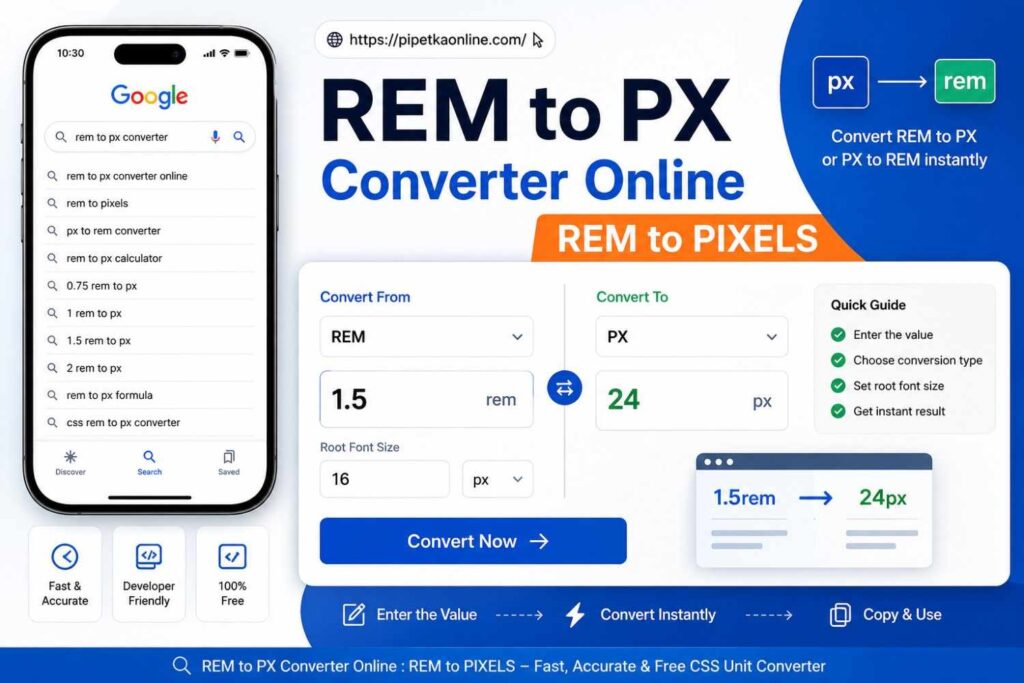
That’s where our REM to PX Converter Online makes the process easy. Simply enter a REM value, choose your root font size, and the tool instantly converts it into pixels. You can also switch from PX to REM whenever you need the reverse calculation.Whether you’re looking for 0.75 rem to px, 1.25 rem to px, 1.5 rem to px, 1.75 rem to px, or simply want to know how many pixels are in 1 REM, this free converter gives you fast and accurate results in seconds.In this guide, you’ll also learn what REM and PX mean, how the conversion formula works, when to use each CSS unit, and why REM has become the preferred choice for responsive web design and accessibility.
| REM | PX (16px Root Font) |
|---|---|
| 0.0625rem | 1px |
| 0.125rem | 2px |
| 0.25rem | 4px |
| 0.5rem | 8px |
| 1rem | 16px |
| 2rem | 32px |
| 4rem | 64px |
| 12.5rem | 200px |
| 15.625rem | 250px |
| 18.75rem | 300px |
| 20rem | 320px |
| 25rem | 400px |
| 30rem | 480px |
| 35.5rem | 568px |
| 37.5rem | 600px |
| 48rem | 768px |
| 50rem | 800px |
| 64rem | 1024px |
| 75rem | 1200px |
What Is a REM to PX Converter?
A REM to PX converter is an online tool that converts REM (Root EM) units into pixels (PX). Instead of calculating values manually, you simply enter a REM value, choose the root font size, and the tool instantly shows the equivalent pixel value.
For example, if the root font size is 16px:
- 0.75 REM = 12px
- 1 REM = 16px
- 1.25 REM = 20px
- 1.5 REM = 24px
- 1.75 REM = 28px
- 2 REM = 32px
These calculations are commonly used when building websites, designing user interfaces, and writing CSS.
A REM to PX converter is especially useful because not every website uses the default browser font size. Some projects use 18px, 20px, or another custom root size, making manual calculations slower and more likely to cause mistakes. A converter automatically applies the correct formula and provides accurate results in seconds.
Whether you’re a front-end developer, web designer, WordPress user, or CSS beginner, this tool helps you:
- Convert REM to PX instantly
- Convert PX to REM with the reverse calculator
- Use custom root font sizes
- Build responsive websites faster
- Avoid calculation errors in CSS
- Save time during web development
Because REM units scale with the root font size, they are widely used in modern responsive design. Converting them into pixels makes it easier to understand spacing, typography, margins, padding, and other layout values before adding them to your CSS. Our free REM to PX Converter Online delivers fast, accurate conversions directly in your browser—no software installation or manual math required.
What Does REM Mean in CSS?
REM stands for Root EM. It is a CSS unit that sizes elements based on the root font size of a web page. The root font size is usually defined on the HTML element.By default, most web browsers use a root font size of 16 pixels (16px). This means:
- 1 REM = 16px
- 0.75 REM = 12px
- 1.25 REM = 20px
- 1.5 REM = 24px
- 2 REM = 32px
If the root font size changes, every REM value updates automatically.
For example:
- If the root font size is 18px, then 1 REM = 18px.
- If the root font size is 20px, then 1 REM = 20px.
This flexibility is why REM is one of the most popular CSS units in modern web development.
Why Do Developers Use REM?
REM helps create websites that are responsive, consistent, and easier to maintain. Instead of updating dozens of pixel values, developers can change the root font size, and all REM-based elements scale automatically.
Using REM offers several benefits:
- Creates responsive layouts
- Improves accessibility for users
- Makes typography easier to scale
- Keeps spacing consistent across pages
- Reduces CSS maintenance
Because REM is based on the root font size, it also respects a user’s browser settings. If someone increases their default font size for better readability, REM-based text and spacing scale automatically, improving the overall user experience.
Where Is REM Commonly Used?
REM is widely used in CSS for:
- Font sizes
- Headings
- Margins
- Padding
- Buttons
- Navigation menus
- Cards and containers
- Responsive layouts
For example, many developers use 1 REM for body text, 1.5 REM for subheadings, and 2 REM or more for page titles. This creates a clean visual hierarchy while keeping the design responsive on different screen sizes. If you need to know the exact pixel value of a REM unit, our REM to PX Converter Online calculates it instantly using your selected root font size. This saves time and eliminates manual calculations.
What Does PX Mean?
PX stands for pixels. It is one of the most common CSS units used to define the size of text, images, borders, spacing, and other elements on a web page. A pixel is a fixed unit of measurement. When you set an element to 16px, it will display at 16 pixels regardless of the root font size. Unlike REM, PX does not automatically scale when the browser’s default font size changes.
For example:
- 12px – Small text or icons
- 16px – Standard body text
- 24px – Large headings
- 32px – Hero titles or banners
Because PX uses fixed values, it gives developers precise control over the appearance of a website.
Why Do Developers Use PX?
Pixels are ideal when an element must keep the same size on every screen. They provide consistent dimensions and make it easier to design components that require exact measurements.
PX is commonly used for:
- Borders
- Icons
- Small buttons
- Images
- Shadows
- Thin lines
- Fixed-width elements
These elements usually do not need to scale with the root font size, making pixels a practical choice.
PX vs REM
Although PX is simple and precise, it is not always the best option for typography and spacing. Modern websites often use REM for font sizes, margins, and padding because REM units scale with the user’s browser settings. This improves accessibility and helps create responsive designs that work well on different screen sizes. PX, on the other hand, remains useful for design elements that require fixed dimensions. In many projects, developers combine both units. They use REM for scalable typography and layout spacing while using PX for borders, icons, and other interface elements that should remain a consistent size. If you need to convert pixel values into REM units or convert REM into pixels, our REM to PX Converter Online provides instant and accurate results without manual calculations.
How to Use the REM to PX Converter
Our REM to PX Converter Online makes it easy to convert REM to PX and PX to REM in seconds. Simply enter your value, choose the conversion type, and get instant, accurate results.
Enter a Value
Type the number you want to convert into the input field. The converter supports both decimal values and whole numbers.
- 0.75 REM
- 1 REM
- 1.25 REM
- 1.5 REM
- 10 PX
- 16 PX
- 24 PX
Select Conversion Type
Choose the conversion direction you need.
- REM → PX converts REM values into pixels.
- PX → REM converts pixel values into REM.
Both conversion options are available in one tool.
Set Root Font Size
The default root font size is 16px, which is used by most browsers. You can also enter a custom root size.
- 16px
- 18px
- 20px
- 24px
View Results Instantly
The converter automatically calculates your result.
- 0.75 REM = 12px
- 1 REM = 16px
- 1.25 REM = 20px
- 1.5 REM = 24px
- 1.75 REM = 28px
PX → REM
- 16px = 1 REM
- 20px = 1.25 REM
- 24px = 1.5 REM
- 32px = 2 REM
Copy the Result
Click the Copy button to instantly copy the converted value. Paste it directly into your CSS, design system, or development project.